Here is a brief history of screen design:
- Early days (1970s): The first screens were text-based and very simple. They were designed for command-line interaction, and they were not very user-friendly.
- The rise of graphical user interfaces (1980s): The introduction of graphical user interfaces (GUIs) revolutionized screen design. GUIs made screens more visually appealing and easier to use. They also introduced new concepts such as windows, icons, and menus.
- The 1990s: The 1990s saw the continued development of GUIs. Screens became more sophisticated and more user-friendly. New technologies such as the mouse and the Internet also had a major impact on screen design.
- The 2000s and beyond: The 2000s saw the rise of mobile devices and touchscreens. This led to a new era of screen design, with a focus on simplicity and usability.
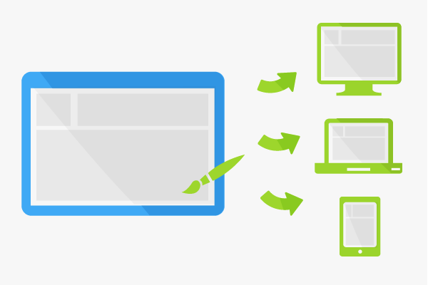
Today, screen design is a complex and ever-evolving field. There are many different factors to consider when designing a screen, such as the user's needs, the device being used, and the context in which the screen will be used.
Here are some of the key trends in screen design today:
- Simplicity: Simple screens are easier to use and understand. They are also more visually appealing.
- Clarity: Clear screens are easy to read and understand. They use clear language and avoid jargon.
- Consistency: Consistent screens are easy to learn and remember. They use the same elements and the same terminology throughout.
- Efficiency: Efficient screens allow users to complete their tasks quickly and easily. They use clear navigation and avoid unnecessary clutter.
- Aesthetics: Aesthetically pleasing screens are more engaging and enjoyable to use. They use colors, fonts, and images that are pleasing to the eye.

